Friday, December 3, 2010

Holiday Open Studios at Tip Top


Today from 5 until 8, and tomorrow from noon until 5, artists at Tip Top Art and Media Center in White River Junction will have Open Studios.  There will be artwork for sale, refreshments, music and more!   Please come and enjoy the festive atmosphere!  I will be showing my floral prints, both hand colored and black and white as well as oil, acrylic and watercolor paintings.  
The latest print in my floral series is just finished.  I think it looks like the flowers are dancing in the summer breezes....

"Foxglove and Black Eyed Susan" 
linoleum print   •   9" x 12"


"Foxglove and Black Eyed Susan"
hand colored linoleum print   •   9" x 12"

Tomorrow, don't forget the Opening of the Holiday in Miniature Exhibition at ArtisTree at 6:30.   Small works perfect for holiday gifts at the gallery just north of Woodstock on route 12.

Monday, November 22, 2010

Stargazer Lily and Morning Glory

It's been a busy and stressful several weeks looking for and finding our new house-to-be!  We are excited to be moving in January to Woodstock where we will be close to friends and stores and I will be able to move my studio to our house.   It has been hard to carve out time to make art and it will be very welcome to be settled in our new place in a couple of months....
Today is a wet, cold, gray November morning and so it is somehow even more pleasant than usual to work on floral prints.   They bring back memories of summer and warmth and color. 
This first print is black and white....


"Stargazer Lily and Morning Glory"
9"x12" - linoleum print

The hand colored print is finished as well....


"Stargazer Lily and Morning Glory"
9"x12" - hand colored linoleum print

I now have four completed prints for the calendar I would like to publish next year.   Each one attaches to a month--and lily and morning glory are definitely some time in the summer!


Monday, October 25, 2010

Randolph Field

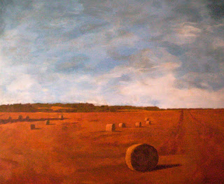
Now that snow has fallen here on Vulture Mountain, this is a happy memory of summer.  It was painted on a sunny July morning standing in a churchyard in Randolph.


"July Field, Randolph"  oil  8"x10"

It is a small plein air painting that attempts to capture the feeling of that warm summer day.  It is lovely to have such a view of nature available as the days are becoming gloomy and cold...

Wednesday, October 20, 2010

Four Flowers


This is the second series of four little watercolors.  The inspiration comes from flowers I have been drawing recently in conjunction with making a series of soft cut linoleum prints.  


I wanted to use simple brush strokes to carry the meaning and speak the reality of iris, sunflower, etc. without being too representational.  So, quirky and humorous though they may be, I think they capture the feel of joy that flowers bring to me.

A few days later, I watercolored some bright yellow and orange paper and cut it into geometric shapes to add my human intrusion into the little flower paintings.  And here are the completed four flower paintings....


I intuited what I thought they needed to become complete....  It's difficult to see it in these photos but the yellow and orange pieces add a third dimensionality to the paintings since they warp nicely.

Tuesday, October 5, 2010

Being Experimental...

I've been enjoying making some small watercolors with a calligraphic feel to them.  Poking around in the library, I came upon a book of sketches and studies by Robert Motherwell and I realized that his Abstract Expressionist work has an spontaneous, calligraphic feel to it.   Then, I looked at several books on Asian art and experimental watercolor and thought about my experience teaching a bit of Chinese brush painting to my Painting One students years ago.  This all led me to create the four 5"x7" watercolors below.  I used a mixture of indigo and ultramarine blues and a soft, wide, flat brush to paint them.


These remind me also of the storyboards I used to put together when working on computer graphics for Colony Video.  I decided that it would be fun to add some collage images to the paintings.  So, I painted some deep red paper and cut it into shapes that I attached to the paper with acrylic medium.  The shapes are not flat but rather curved and make for an interesting low relief.


I am not sure what the story is that they are telling and I am not sure where these are going but I do have more on my drawing board at the studio....

Sunday, October 3, 2010

A Plein Air Day

This week, Sandy and I went to Braintree Hill in Randolph to paint plein air one lovely, sunny morning.  At the top of the hill is an old church and graveyard.  I got so taken up with taking photographs of the cemetery nearby, I ran out of time to paint.  So, instead, I sketched.  
Here are a couple of drawings from our time outdoors in the fresh air...


This is a marker drawing of an ancient tree that caught my eye.  I loved the way the trunk split into two separate sections and how full the tree was despite its age.  It looked like an apple tree to me but it had no apples so maybe it's some other kind.  Sitting on a stone fence was not the most comfortable place to rest!


And this pencil sketch is the view looking back up the road to the crest of the hill.  To the right was a corn field and the sun was warm and friendly as I sat on the bumper of the car....

Sunday, August 29, 2010

"Iris and Forsythia" complete

This afternoon I sat out on the deck on this beautiful late summer day and finished adding color to the linoleum print I've been working on and sharing with you.  Here's the way it looked last time as a black and white print....

                                                                 
And here is the finished product....


Iris and Forsythia
hand colored linoleum print - 9" x 12"

I think the color really brings the flowers to life.  I had forgotten how waxy and blendable Prismacolor colored pencils are but they allowed me to play back and forth with colors and values almost as if I were painting.  Completing this piece is motivational to me in continuing with the series.

Monday, August 23, 2010

Printing an Edition

I have finished cutting the printing plate I talked about last week and have printed "Iris and Forsythia".  It's always exciting to see what that first print will look like because despite lots of planning, it's always a bit of a surprise....


Partially cut soft cut printing plate

In order to print, I gather up my materials and head to the kitchen to be near the sink and to use the counter to spread out my work.  


Inking the printing plate

I roll out the black Speedball water soluble block printing ink with a 4 inch wide soft brayer, making sure that there is an even coat on the whole surface of the linoleum.  It's easy to see where the ink is because it is shiny and black.  Some of the cut areas pick up ink too and I like the value and textures the lines create.  I have to be careful NOT to get any blobs of  ink on the brayer or they will fill in the incised areas on the plate.


The inked plate with tape for centering the print on the paper

Next, I move the printing plate over to where I have measured out rough masking tape guidelines for the printing plate and paper so that the prints will be consistently centered.  In this case, I don't have to worry about being too careful.  If I were using a multiple number of plates or doing a reduction print where I would print the same plate several times, I would have to construct a more elaborate registration box.


Rubbing the print

When the paper is centered on the plate, I use a wooden spoon to carefully rub the back of the paper to make sure all areas of the plate have printed.  Here, you can just make out the ink beginning to soak into the paper.  I usually peek underneath to make sure it looks good before I pull the print off the plate.


"Iris and Forsythia"
9" x 12" • linoleum print

And here it is, the first finished print, called the "Artist Proof".  It is meant to be a test print and if I am pleased with it and it needs no more cutting, it becomes the standard for the edition.  I want each of the prints to be as exactly the same as possible and I might discard any that do not meet this standard.  But, in this case, I'm pretty pleased.  I do think that if I had treated both ferns as I did the one on the right, the print would be more balanced in terms of black areas.  When I add color this print after it is dry I will be able to compensate for this if I choose to do so.
I pulled 13 prints today and after printing 6 of them I had to take time out to wash and dry the plate since it had gotten pretty scummy.  I intend to print some more later.  The prints need to dry completely and that can take several days in humid weather.   Then, when there's no chance of smudging, I will have the fun of hand coloring one using colored pencils....

Monday, August 16, 2010

Painting an Abstract

One night at a party, someone asked me, “How do you know how to paint an abstract painting?” It was an overwhelming question for me, but this week I thought I might try to answer it from my own humble experience....

The elements and principles of design are important in any kind of artwork, whether it is two or three dimensional, abstract or realistic, because they organize the composition. But in an abstract work, the elements and principles and the visual idea are all that the artist has. If there is anything recognizable, it is altered--abstracted--until it may be simply a suggestion of reality. So, the success or failure of the piece depends heavily on the merits of its composition.

The elements of design include: line, shape, size (scale), texture (surface quality), color and value (darkness and lightness). The principles of design are the ways in which the elements are organized and include: balance, repetition, rhythm, contrast, harmony, movement and unity. Some folks might add or subtract a term or two or perhaps use somewhat different terms but these are the basics. In truth, how well the elements and principles of design are utilized in communicating the feeling or message of the work, determines how successful any piece of art will be.

When I begin an abstract painting, I have in mind a visual idea I want to play around with--it might be the chaos of a nebula...

Eagle Nebula #2

or the feeling of being drawn toward the light of morning...

Land of Light

I am very aware of the elements and principles as I organize the painting. Using thick, thin and directional lines and repeated shapes, I try to create a sense of rhythmic movement. I choose appropriate textures and think about patterns of contrasting darks and lights and how they balance. I decide where to locate the focal point and how relatively large and small shapes will be. The color palette I choose will add or detract from the harmony and unity of the piece. There's a lot of thinking and intuiting going on in this process, and it is both absorbing and challenging. Each choice made is an attempt to move the work closer to the little imaginary, abstract place I want to create. It takes a lot of time and practice to become fluent enough to move easily through this visual world. But it never gets old and it never stops being a fascinating challenge.

Friday, August 13, 2010

In-process Soft Cut Linoleum Print


For the past several weeks I've been working on the linoleum prints I mentioned way back in March.  In fact, I spent last Friday night at Tip Top Open Studios cutting away on my soft cut linoleum and visiting with Larissa from across the hall.
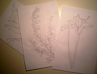
The first step in making a print is making drawings, in this case, pencil sketches of flowers.  It's a good time of year to be doing this!  I have many small drawings--pansies, forsythia, iris, day lilies, clover, black eyed susans, daisies, many un-named wild flowers I've found on our morning walks.  Plus lots of sketches that just don't want to work.
For this print, I chose forsythia, iris and ferns to play with in making a design....


Flower pencil sketches

After the drawings are chosen, the next step is creating a pleasing composition for the print.  This means tracing the sketches with a some tweaking here and there.   For example, some sections of the sketches may be repeated for emphasis.  I try to balance what will be cut out of the block to leave the paper white and what will be left to hold the ink and print black.  I want to have some black, some white and some textured gray.  I often add leaves, vines, stems, etc. to fill in empty areas.... 


Final design on tracing paper

The final design for the print is transferred to the soft cut block in pencil and then Sharpie marker to clearly mark the places that will and will not be cut. 


Partially cut soft cut block

The printing plate above is almost finished.  Hopefully you can see the marks of the linoleum cutter in the background.  These will be important when the plate is printed, adding texture to the negative space.  Next week?  Hopefully the finished product!

Thursday, August 5, 2010

A Quechee Field in July


It's been awhile since I've posted and I cannot say I have a good reason/excuse for that.  Putting the house on the market?  Maybe.  Vacation?  For sure!
But I have been out painting and here is the most recent large landscape.


"July Field, Quechee"
acrylic

Since I painted this, the field has been mowed and the wild flowers too.  Still, my love for these bountiful, beautiful fields is not diminished and August and September remain...

Tuesday, April 13, 2010

New Brunswick Hay Rolls

This painting is based on another of the photos I took in Canada last September.  This beautiful vista appeared as we rode along past autumn fields.  There were fallow fields already harvested, fields of potatoes and corn and this field of rolls of hay basking in the afternoon sun...


"New Brunswick Hay Rolls"
acrylic - 30" x 36"

Here, the ski is dominant and the color palette is warm and complementary.  It captures the feel of fall and the land spread out before us to the horizon.

Monday, April 5, 2010

New Brunswick Farm House, Two Ways

This is the second small oil painting of New Brunswick--a farm across a large field.  


"Fall Farm"
8" x 10" - oil

Completed awhile ago, it was a study for a larger painting.  And here is the larger acrylic painting I made after the study in oil.  The horizon line has been lowered to show the glorious sky which felt as if it went on forever.  I think that makes the painting feel more expansive and free....


"New Brunswick Farm House"
acrylic - 30" x 36"

The color palette is different too--warmer and more complementary.  Each of these paintings is a view of the same place yet each of them is different in content and in feel.  This is intentional on my part.  On any give day each of us is a different person.  On any given day, as an artist I hopefully have something different to say.

Tuesday, March 30, 2010

New Brunswick Salt Marsh, Two Ways

This is the first, small oil that became the study for the larger painting I completed last week.  It is quite traditional and peaceful....


"Salt Marsh, New Brunswick"
8" x 10" - oil on canvas

The painting below is based on the same photos of the same marsh.  But it is different in many ways from the study.  I wanted to show the liveliness of the grasses and the light of the day which give a different feel to the experience of viewing the work....


"New Brunswick Marsh Land"
36" x 40" - oil on canvas

I hope I was successful in communicating the brightness and excitement of the natural landscape.

Tuesday, March 23, 2010

Poppy and Sunflower Linoleum Prints

For a change of pace, I am going back to an old love, printmaking.  The two prints here were made awhile ago and my thought is to create a series of floral linoleum prints and maybe turn them into a calendar.


"Poppy and Sunflower"
9" x 12" - lino print


"Poppy and Sunflower"
9" x 12" - hand colored lino print

This second print is hand colored with Prismacolors.  Wouldn't it be fun to use the calendar as a coloring book?  If the prints for each month were in black and white, everyone could do their own hand colored versions.

Monday, March 15, 2010

Nebulae: First in the Orion Series

The beginning of my latest Nebula series is based on Hubble photographs of the Orion Nebula. This is a cavern of gas and dust, forming thousands of stars. The energy released by these young stars whips their surroundings into fantastic forms.

ORION #1

Although the tumultuous clouds of gas and dust are illuminated by ultraviolet light from four hot, massive stars within Orion, still the Hubble images are more lovely and pastel than those of the Veil and Eagle Nebulae which inspired earlier abstract paintings in the nebula series.

In this painting, I tried to capture the feeling of movement and transparency that exists within this vast space and to contrast the mysterious darks and lights created by the collision of forces inside the Orion Nebula.

Nebulae: the Veil Series

The Veil Nebula is part of the Cygnus, or Swan constellation. This nebula is the remains of a supernova that exploded between five and eight thousand years ago. What we see now are the wispy leftovers of this explosion. It is a dark place, veiled with bright streams of multicolored light, difficult to see and wonderful to behold....

My interpretation of this nebula is a series of mixed media pieces in which I used modeling paste, acrylic paint and collage on gessoed paper. For me, the gold lines and shapes represent the human intrusion into space--into all of nature.


"Veil Nebula One"
acrylic and collage on gessoed paper - 18" x 22 1/2"


"Veil Nebula Two"
acrylic and collage on gessoed paper - 18" x 22 1/2"


"Veil Nebula Three"
acrylic and collage on gessoed paper - 18" x 22 1/2"


"Veil Nebula Four"
acrylic and collage on gessoed paper - 18" x 22 1/2"


"Veil Nebula Five"
acrylic and collage on gessoed paper - 18" x 22 1/2"


I'm happy that recent repairs to the Hubble telescope will make it possible to capture more of these wonderful images. My paintings are a far cry from the original Hubble photos, however. For me, the photos are only a starting point. I hope they capture a bit of the feel of that amazing, long ago time when there was a clash of energies and the Veil Nebula was born.


Saturday, February 27, 2010

Nebulae: the Eagle Series

Last year I became fascinated by Hubble photographs of space.  The Eagle Nebula was particularly intriguing to me.  Looking at those photos and feeling the deep space documented there motivated me to respond with these two paintings...


"Eagle Nebula #1"
Acrylic on canvas - 30"x40"


"Eagle Nebula #2"
acrylic on canvas - 18"x24"

Watercolor Abstracts

When I painted these four watercolor abstracts I wanted to capture the feel of time and place.  Here there is no longer any grid but the sense of human presence is created by the intrusion of geometric shapes that add an architectural dimension to the works....


"In the Dome of the Sky"
watercolor - 16"x22"


"City of Light"
watercolor - 21"x28"


"Toward the Light"
watercolor - 15"x21"


"Asian Realm"
watercolor - 16"x23"

Monday, January 18, 2010

Gridded Landscapes

I call these pieces gridded landscapes because although they attempt to capture the feel of a place or a day or a thought and they all relate to landscape, they are composed inside a grid which may be broken in places.  The grid imposes a human structure on the landscape and provides a kind of storyboard in which to tell the tale of an observed set of images.

There may be a suggestion of rain or snow or sun or rock.  Here, the colors are dark, recalling the feel of an impending storm...


"Storm Day"
watercolor, graphite, colored pencil


In some places, natural forms like grass or moon are recognizable.  In other parts of the grid there might be just the suggestion of trees, roots, weather.  This piece was inspired by a drive from Massachusetts to Vermont on a winter day...


"Mountain Day"
watercolor, graphite, colored pencil


The juxtaposition of nature and man-made structure may be evident.  And perhaps there is a tension between the two....


"Sky Interrupted"
watercolor

Monday, January 4, 2010

Accordion Books

After creating several psalm paintings, I began to make accordion books using quotes from the Bible and authors like Thomas Merton who always brought me comfort....

This quote is taken from his book, "Thoughts in Solitude"....


"I Will Not Fear" - 12" x 21"


And the following books are illustrated psalms....


"Had I But Wings" - 8" x 18"


"You Have Formed My Inmost Being" - 8"x18"

Psalm Watercolors....

Awhile ago, I created several watercolors using the psalms as a springboard for my paintings. This first is based on Psalm 46...


"There Is a Stream" - 12" x 16"


And this is Psalm 63 where God is the center...


"I Shout for Joy" - 12" x 16" 


Psalm 62 shows the calm within and the chaos without...


"I Shall Not Be Afraid" - 12" x 16" 


Tthe next painting is based on psalm 27...


"Lead Me on a Level Path" - 12" x 16" - sold